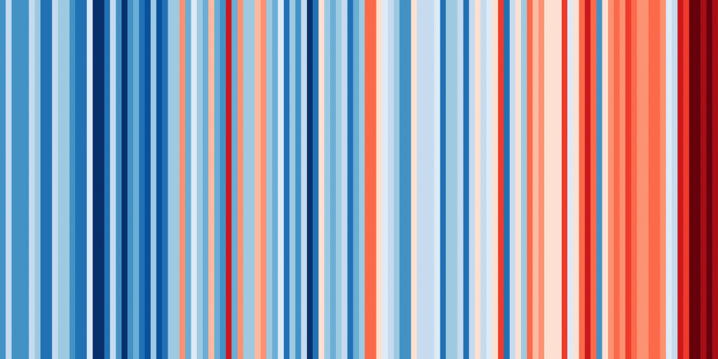
Thanks to a clever idea by scientists at the University of Reading, you see how much average temperatures have risen over time where you live. It’s part of an international campaign to highlight the importance of climate science. You can then ‘show your climate stripes.’


Show your stripes, Global 
Show your stripes, California, USA
I created my own stripes for my home city of Oxford, and it’s really interesting comparing these to the global version, and for further comparison, one for California in the USA (see above).
The team from the University of Reading’s Institute for Environmental Analytics developed this really interesting way of communicating about global warming. They are asking everyone to ‘show their stripes’ to help raise awareness of the climate crisis, and to support climate scientists worldwide who are helping to fight it.
“It is crucially important that society wakes up to the dangers of allowing global temperatures to continue to rise unchecked. Global warming is already presenting risks to health and society as we know it, and the climate crisis will become very real unless we take action now.”
Gabriel Hemery
Anyone can see how temperatures have risen where they live and share this with others by creating a unique set of stripes for their home town. It will help bring home how the climate crisis is an issue for us all, no matter where in the world we live.
In every case, the thick band of red stripes on the right-hand side acts as a stark warning of how human action has contributed to the climate crisis, making the graphic an effective way of raising public awareness of the issue.
There is even some Climate Stripes merchandise!
Read more about global warming, the climate crisis, and resilience
 This work is licensed under a Creative Commons Attribution- NonCommercial- NoDerivs 3.0 United States License.
